Hyve

Summary

Why HYVE?

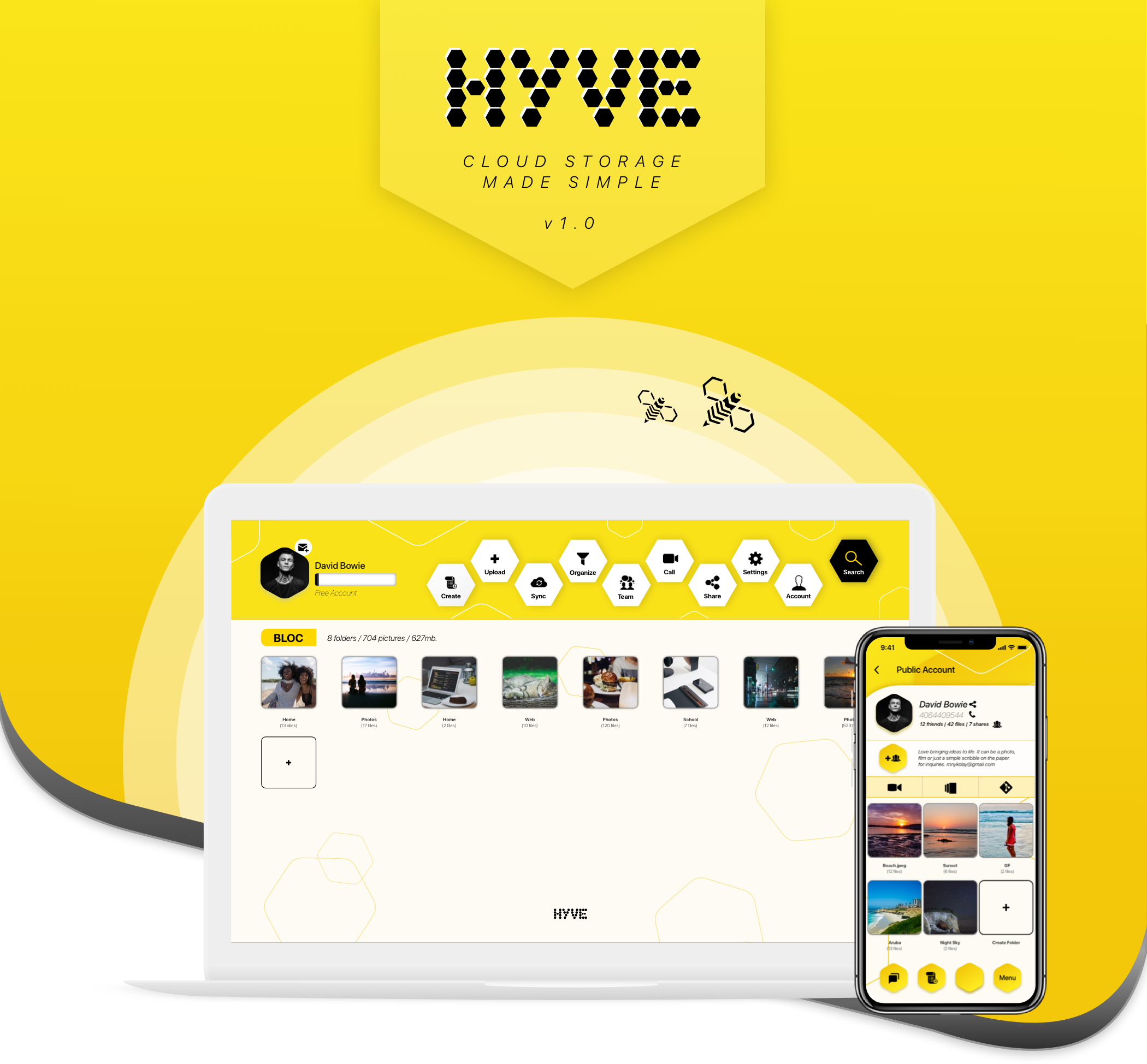
Being natural-born creators we tend to bring ideas into life. We use various tools to help us through the day, it can be email, social media or just some scribble on the paper. The list of tools growth daily, but how do we make sure that we use them efficiently? Cloud storage industry even though saturated, haven’t quite positioned itself as “place for collaboration and creativity”. Millions of people use outdated features that neither user friendly or efficient in a day of social media interaction. This project has led me to believe that this is exactly what people want. I designed HYVE specifically for this reason, to connect all the tools we use daily into one robust platform. HYVE is a place for people to share their ideas with the world.
Start
Overview Icon
Problem and Solution Icon

Problem

The problems demystified

After analyzing the market, I began noticing patterns that dictated my focus on the two problems I simply couldn’t ignore.

1) Low interface discoverability.

Cluttered interface is a common problem among users. The sheer volume of features can get a lot of users feel forced to learn through unnecessary trial and error.

2) Untapped community features.

While I had initially set out to re-examine the usability of current cloud storage products, what I found — in addition to a streamlined user experience — was the need for social media integration.

Solution

A seamless interface & a social integration

Solving for two completely different problems didn’t come easy as it was a process of continuous reiteration. To solve for the problem of low discoverability, I made the following design decisions:


  • Design an intuitive interface that goes hand-in-hand with social media interface. Which in turn creates a familiarity and recognition over long term.
  • Use top-level navigation and organize items folders/categories.
  • Provide user-centric notifications that educate new users on the primary navigation and a general user flow.

But that wasn’t all. Through my research, I realized that users wanted more than a seamless user experience – they were looking for a social-media integration so they can interact with like-minded people. Hyve fills the gap in this space by introducing a seameless backup of all your social mttedia accounts and having them backed-up up on the go.

User Survey Icon

User Survey

Getting to know the users

To understand how I arrived at the solutions to the problems at hand, I had to go back to the beginning — starting with user research. I began with a user survey and sent them out to my friends, social media, and coworkers in order to understand the goals of my target audience. The results from the survey would inform the following:

How often users use cloud storage;
What are the most important features;
What are their top frustrations;
What cloud storage platforms were most favored;
How important is ability to share to social media;

The survey questions were completed by over 30 respondents.

Target Audience

Based on the screened survey, I found that the users that best aligned with my primary audience were the big curious-minded thinkers and doers. They were the designers, freelancers, illustrators, entrepeneurs, etc. between the ages of 20 and 35 in the creative tech industries who were constantly brainstorming and seeking perspective from professionals.


Audience Icons
Survey Target Icon

66.7% of respondents would like to be able to share to social media straight from the cloud.

When asked what features users must have


95.8% chose auto sync


70.8% selected file versioning


67% want to be able to collaborate


45.8% of respondents use cloud storage daily


25% 2-3 times a day


16.7% once or twice a month

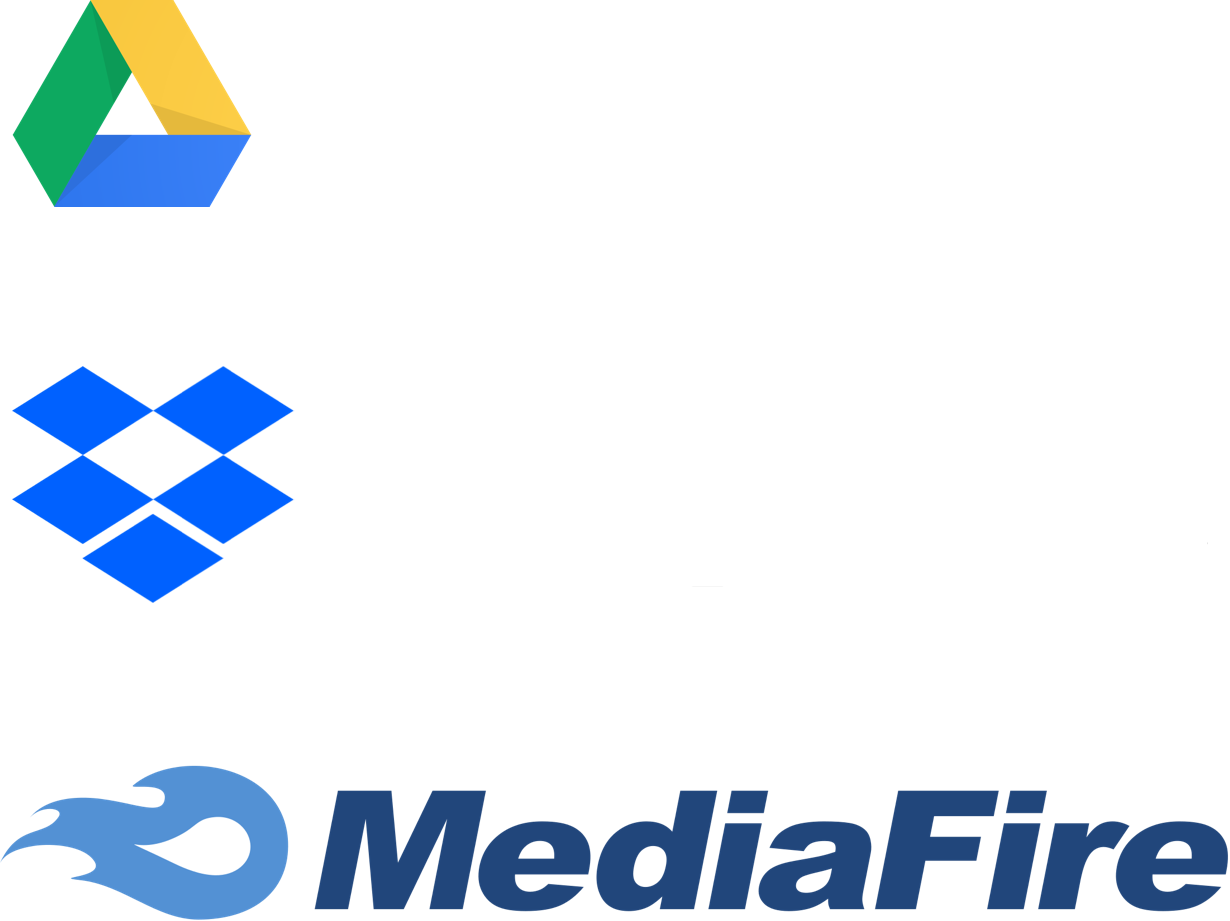
71% use Google Drive, 25% prefer Dropbox, 12.7$ use MediaFire

Key problem insights

Magnifying frustrations

To review the results from the user survey, here were the most prevalent frustrations when it came to cloud storage platforms:


  • Keeping content organized is a headache when there are many files.
  • Lack of social media integration so users can directly share files to social media
  • Lack of good UI when it comes to team collaboration tools.
Magnify Icon

Competitive Analysis

Converting weaknesses into strengths

While undergoing my competitive analysis, I noticed that low discoverability due to cluttered content organization and an overflow of accented links were common weaknesses shared by the competition. I sought to turn this weakness into HYVE’s strength by making discoverability a high priority. I also noticed that many users wanted a social media integration. Sharing to Instagram and also having all their images/posts/comments backed up was a priority.

VIEW
Cloud Storage Competitors Logos

User Personas

Motivations

Average day for Susan consists of countless calls, meetings and negotiations. She finds it important to be able organize everything on Google Drive. The ability to have various Google Apps connected together to form a strong platform is important to her. Susan would definitely recommend it to a friend because creating, organizing and sharing files is definitely easy and intuitive.

"Google Drive has certainly made me more organized!"

  • Goals
  • Be more organized.
  • Never be late for a meeting.
  • Learn how to mute apps.
  • Frustrations
  • Too many apps to serve one need.
  • Can't view all files.
  • Silencing apps is confusing.

BIO:

Susan has been working in the human resource for over 10 years. Her passion for all things tech have certainly made an impact on her life. She definitely learned how to be able to strive in the world of innovation by emracingnew tech such as: wearables, voice assistants, electric cars and more.

User Persona Icon

User Personas

Motivations

Average day for Arsenii consists of planing & organizing various tasks, meetings and problem solving. He finds it important to be able to leverage his Dropbox to store all his files and being able to access it on the go. Arsenii would definitely recommend it to a friend. It definitely made his life more organized and easy. Even though he uses it mainly for productivity he would appreciate an addition of video features and smart lock security implementation.

"Dropbox makes it easy to organize & share files."

  • Goals
  • Better organize folders.
  • Use my watch more for sharing files.
  • Use it more for productivity.
  • Frustrations
  • Team collaboration limitations.
  • Limit disk space.
  • Somewhat pricey.

BIO:

Arsenii has been working in the human resource for over 10 years. His passion for all things tech have certainly made an impact on his life. He definitely learned how to be able to strive in the world of innovation by emracing new tech such as: wearables, voice assistants, electric cars and more.

VIEW PERSONAS
Information Info

User Stories

User Stories and Flows Icon

User Flows

Mapping the MVP by defining user goals

Keeping the personas in mind, I compiled a list of high priority user stories and converted them into user flows to show how the user can accomplish primary tasks, like the two below.


"As a new/return user, I want to share files/folders to social media"

User Flow

"As a new/return user, I want to link/sync my social media accounts”

User Flow

Wireframe Sketches

Bringing ideas to life

Beginning with pen and paper after having created my sitemap, user stories, and user flows, I could move onto building the skeletal structure of the site through wireframes — starting from simple wireframe sketches to low fidelity wireframes.

Wireframe Sketches Icon

Low-Fidelity Wireframes

Revisiting the problem to build the skeletal structure

To address the issue of low discoverability within cloud storage interfaces, I chose to display a top-level navigation and an easy to access add button that increases usability. This top-level approach eliminated unnecessary clicking and the reliance on the search box to find files. Using my sitemap and user flows, I built my wireframes using Sketch.

Low Fidelity Wireframes Icon

Design Updates

Reducing visual confusion

With the accumulation of golden nugget knowledge gained from testing my wireframes, I was armed with the knowledge needed to make the following revisions.

Redesign the "Create" button

Design Updates

While the left “Create” icon on its own is somewhat used in similar platforms, many testers did not recognize it as a way of creating new content. Based on the results, 72% of respondents felt the one on the right was better.

Design Changes
Design Updates Icon
Summary of Changes Icon

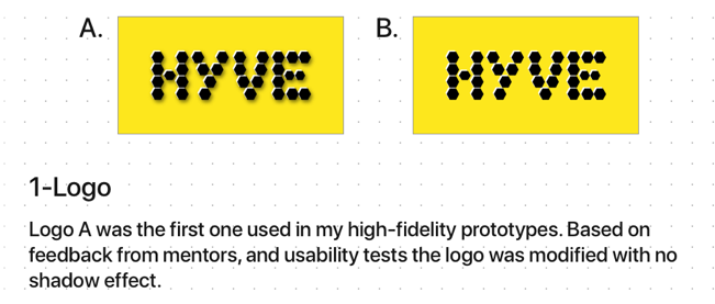
Logo Design

Creating a logo that sparks imagination

After selecting the brand name, the logo underwent a variety of sketch iterations before arriving to its final iteration.

Logo Design Icon
High Fidelity Prototype Icon

Summary

Through the course of this project I've been able to distinguish key metrics for a successful cloud storage app. Due to a highly saturated market I knew coming in that there would be some challenges but what I found was exciting and informative.


  • Challenges, mistakes or revelations:
  • Honeycomb Pattern. Even though I went with a honeycomb pattern and wanted branding specification to be seen throughout, I have to admit it was the biggest challenge. Incorporating hexagonal shape in a way that is not distracting and that it compliments each object was definitely a learning curve.
  • iPad for Cloud Storage. My original thought was that the iPad would be an ideal way to manage cloud storage. Thankfully upon testing and mentor feedback, I’ve realized that users don’t see iPad as an adequate device for their cloud storage needs.
  • Social Media. The biggest “Aha Moment” happened upon testing the market and realizing that there’s a growing need for social media backup and integration. Another surprising discovery was that users thought that being able to post straight from the cloud should be a must-have feature.
  • Overall I thoroughly enjoyed this project and looking forward to my next challenge.

Back to Top Icon